Monday, April 27, 2009

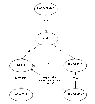
Concept Map


Concept maps create a visual picture to explain words or ideas. For example this map shows the idea of a Concept map. Concept maps seek to organizes words and ideas into a hierarchical structure

http://redie.uabc.mx/contenido/vol2no1/art-11-eng/contenido-ruiz-figura1.png

Wednesday, April 22, 2009

Univariate choropleth maps


Unlike a Bivariate choropleth map, which displays two unrelated sets of data, a univariate map only displays one variant. In the map above the colors represent the water usage in millions of gallons per day.

Nominal area choropleth map


In this map the colors represent different provinces in Iraq. With each province comes a different political system and varied beliefs. The names of the provinces are clearly marked.

DOQQ

"DOQQs are color infrared images with one meter per pixel resolution. DOQQs are provided in the UTM coordinate system; the DOQQs you have downloaded are in the UTM zone 14 (UTM83-14), and are in MrSID format:" The scale is useful because any viewer will know what size area they are looking at

http://www.fmepedia.com/index.php/Raster_Mosaicking_Scenario
Link to Picture and text

DEM


DEM stands for Digital Elevation Map. This is a form of remote sensing. You can clearly see the mountains, along with many other physical features.
http://eros.usgs.gov/images/dem.jpg

DLG


Digital line Graphics display roads, rivers along with other valuable information. You can use DLGs to navigate around town, or to show proximity of a location.

http://www.mpassociates.gr/software/distrib/science/rock/dlg_plot.jpg

Isopleths


An isopleth map generalizes and simplifies data with a continuous distribution. It shows the data as a third dimension on a map, thus isopleth maps are more common for mapping surface elevations, amounts of precipitation, atmospheric pressure, and numerous other measurements that can be viewed statistically as a third dimension. This map shows Sulfate ion concentration in the U.S.


Isopach


Isopach display the thickness of rock beds or sediment deposits. They allow engineers, contractors, researchers, and geologists to more accurately know the how far they will have to drill to complete their jobs. For examples it displays the depth of a possible water table for research or use as well as oil deposits, and other fossil fuels.


Isohyets


Isohytes display rainfall using contour lines. These lines show geographical areas that have the same amount of rainfall. Here is the annual rainfall measured in mm for a region.
http://soer.justice.tas.gov.au/2003/image/265/water%20quantity/m-ilw_quantity_rainfall-l.gif

Isotachs


Isotachs are used to display winds speeds, of different geographical areas, that are the same. Using contour line intervals the information is displayed very organized and easy to read. Isotachs are used in weather prediction. This map shows the wind speed taken at 500Mb above ground, and is valid for 6 pm CST on February 23


Range graded proportional circle map

With in each proportional circle there is additional information displayed about that point. The advantage to this is being able to display several different types of information at one time. This particular map is also a classed choropleth map. By overlaying several types of maps you can display large amounts of information in an organized easy to read format.

http://geographyfieldwork.com/Choropleth2.gif

Classed choropleth maps


This is a great example of a classed Choropleth map. It is classed because of the key located on the map to explain the divisions. This map shows the infant mortality rate representing deaths per thousand live births. This type of map very clearly displays the data and is very easy read.


http://www.es.mq.edu.au/courses/GEOS219/images/deaths.jpg

Bivariate choropleth maps

Just focus of the map of Africa and you will see a Bivariate choropleth map. The Key box displays the Two variables that are represented on the map. This Maps shows the life expectancy and the GNP per CAPITA.

http://www.geocities.com/stevejford/Africa_Choropleth.jpg

Star plots


Star Plots are a useful way to display multivariate observations with an arbitrary number of variables. Each observation is represented as a star-shaped figure with one ray for each variable. For a given observation, the length of each ray is made proportional to the size of that variable. For example each star plot above represents a vehicle make and model. each ray represents a variate such as weight, price, size, horsepower, and many more. The length of each ray represents the value for that variate.

Correlation matrix


A correlation matrix is a table that can show multiple correlations among multiple cases.
"Shown above is a calculated protein correlation matrix for phage T7. Correlated behavior ranges from high(red) to low(blue), and the triangular block of red reflects proteins involved in phage assembly, a highly coordinated process."

http://yin.che.wisc.edu/images/ProteinMatrix.jpg


http://images.google.com/imgres?imgurl=http://yin.che.wisc.edu/images/ProteinMatrix.jpg&imgrefurl=http://yin.che.wisc.edu/images.htm&usg=__u__NVmwj_A-AyVDjgqNfJdmavVE=&h=532&w=627&sz=43&hl=en&start=1&um=1&tbnid=dYKjnVgUVSLaKM:&tbnh=115&tbnw=136&prev=/images%3Fq%3DCorrelation%2Bmatrix%26hl%3Den%26rlz%3D1T4ACGW_enUS309US310%26sa%3DG%26um%3D1

Stem and leaf plot


Stem and leaf plots are a well organized way to display numerical data
The stem is located on the left side of the line. the stem is the number other than the ones column. For example 143 the stem would be 14 and the leaf would be 3. this stem and leaf plot could be test grades on a math test, or age of a bowling league. Unlike a box plot it is very hard to quickly determine range, mean, median, and other statistical data.


Box Plot

This Box plot displays the annual snow depth at a ski resort. One of the best things about a box plot is you can quickly see the average depth, the highest, and the lowest without doing any calculations. It also clearly displays the range, and median.


Histogram

Histograms are a very common map that is used to display numerical data. This histogram shows the number of employees in company that make predetermined "salary ranges" which do not overlap. You can have space between each range but it will not have a numerical value.


http://www.statcan.gc.ca/edu/power-pouvoir/ch9/images/histo1.gif

Tuesday, April 21, 2009

Parallel coordinate graph


Parallel coordinate graphs are used to display multiple variables. This Map is actually in 3d using digital technology. It is comparing nine different variables along the x axis. All values can be seen at one time allowing for mass information flow.


Triangular plot


Triangular Plots are the best way to display three variables. Being three sided they offer the most organize way to display the information.


Windrose


Windrose maps are used to measure direction and intensity of winds recorded. Using the azimuth directions you can determine the direction of the wind. Then by looking at the length of the vector you can see the intensity.


Climograph


A climograph displays rainfall and temperature on the same graph. This can be used to track weather patterns, and possibly predict future weather. This Cliograph is for walgett Australia. It displays the month and the rainfall and temperature for that month


Population profile


Population profiles give a quick detailed breakdown of a given population. They show how many people of each gender are at what age. This is useful in economics because you can predict future tax base, and future tax burdens. It is also helpful to see how your population is changing.


http://www.coventry.gov.uk/ccm/cms-service/stream/image/?image_id=1660022

Scatterplot


A scatter plot is an plot that shows the relationship or trend between two variables. You can determine a trend for data after you have plotted most of the points. While you may have outliers the trend line will fit most of the data


http://www.netmba.com/images/statistics/plot/scatter/scatterplot.gif

Unclassed choropleth maps


This is an unclassed choropleth map that does not break down what each color means. without defining this this map is only pretty to look at. You have no idea which areas have high access to safe drinking water and which have low access. The only information you see is that the access varies depending on the region.


http://menris.icimod.net/UserFiles/Image/capacity%20building/elearning/Figure%208_3b.jpg

Standardized Choropleth map


Standardized Choropleth maps display information that has been standardized. The information displayed is compared to the same standard making it easy to compare. This one compares expenditures by county in NC

Bilateral graph


Bilateral graphs are used to display multiple variables on the same graph to show trends and compare how the variables effect each other. This Bilateral graph displays the trends of accepting trainees in relation to the number of experts needed.

http://www.mofa.go.jp/policy/oda/category/environment/pamph/2001/image/1_3.gif

Index value plot


Index value plot displays data compared to a "normal index". The plot to the right displays the data for streamflow in New Mexico since 2001. The normal index was set at 4. Anything above 4 is considered above normal and those points that are below are considered below.


http://water.usgs.gov/waterwatch/regplots/pa01d/pa01d_nm_2.gif

Lorenz Curve

A Lorenz curve is a graphical representation of the cumulative distribution function of a probability distribution. The line of equality displays the values of x and y being equal of a 1 to 1 ratio. The Lorenz curve shows the actual distribution. This one shows the cumulative % of households related to the cumulative % of income.


http://www.sarpn.org.za/documents/d0000990/images/lorenz_curve.gif

Isobars


Isobars are used to display atmospheric pressure. They use contour lines to show areas of equal pressure. These maps are often used to predict the weather.This map displays air pressure over western Europe


LIDAR


Laser-based imagery. Utilizes laser pulses and global positioning system to develop detailed images of earth surface. This is a detailed image of the World trade center Pre (911)


Doppler Radar

Doppler Radar is used everyday to help display the location of severe weather and rain. Doppler Radar sends out waves and then measures the time and intensity they are reflected. This image shows a well organized tropical storm or hurricane. The green areas show moderate rain while the red and yellow show more severe weather. Doppler radar is a key tool in saving lives threatened by severe weather.

Black and white aerial photo


Black and white aerial photos are one of the most common types of photos. this one here shows Wrigley Field in Chicago. They offer a "birds eye view" of our favorite landmarks.

Infrared aerial photo

Infrared aerial photos can display lots of useful information. Not only can they show location in proximity to know land marks like black and white photos, they show contrasting heat. You can tell the tree make up of a forest. ( hardwood vs pine) You can also use them to see how much heat energy an industry or city emits.


Cartographic Animation


Cartographic animations are most commonly used in weather imaging. The animation is used to track the image across "space". Often these images are seen on TV weather reports or using computers via the internet.


Statistical maps


Statistical maps display statistical data. Many times it is a percentage change over time. Statistical map of Africa shows the growth of the Internet from July 1995 to July 1996. as you can see there are even areas that the Internet decreased.


http://personalpages.manchester.ac.uk/staff/m.dodge/cybergeography/atlas/mids_af_i_gr_c_large.gif

Cartograms


This cartogram shows the substitution of a standard unit of measure. The earth appears to be disfigured. Some areas appear to be larger or smaller than in a traditional depiction.


http://freegeographytools.com/wp-content/uploads/2007/09/271c-thumb.png

Flow maps


Flow maps show linear movement between places. The thickness of the paths indicate quantity or volume. IN this chart the flow of product X flows from start to its final destination. The wider the band the more volume is flow

Isoline maps


Mental Maps


Mental maps are used everyday to help people find particular locations. Most mental maps are not to scale, and are made from memory. Using landmarks is a very easy and effective way to communicate directions. In this mental map known landmarks are clearly used.


http://www.uky.edu/~ulack/Geo152/unnumbered%20figure%20pg%2003.jpg

Proportional circle maps

Proportional circle maps use circles to represent numerical data. The larger the circle, larger the data value. Although it is not politically correct this maps displays the number of " Mexicans" living in each state. The size of the circle is to emphasize those states with larger populations.


http://www.neiu.edu/~jrthomas/377/circle.jpg

Hypsometric


A Hypsometric map displays the shape of the earth's surface. This is known as relief. A Hypsometric map uses color and shading to show elevation rather than contour lines.

Monday, April 20, 2009

PLSS Maps


"The Public Land Survey System (PLSS) is a way of subdividing and describing land in the United States. The PLSS is used to divide public domain lands, which are lands owned by the Federal government for the benefit of the citizens of the United States." Many towns use this for the 911 grid system. In the map they use meridians to mark east and west limits and then north and south boundaries.

Cadastral


Cadastral mapping is one of the best known forms of mapping, because it is the mapping that shows all of the land parcels in relation to one another and to the adjoining roads. It is also one of the most ancient forms of mapping – for example ancient Egyptians are known to have developed cadastral records so that land ownership could be re-established after the annual flooding of the Nile River. Cadastral maps show legal plots of land and how they border each other. Each individual plots is know as a Cadastral Plan which is a legal, binding document. When purchasing a home or property you are required to have a current survey "Cadastral Plan" on file with the proper office before you can get insurance or even close on the purchase.

http://www.icsm.gov.au/mapping/images/isis_cadastral.jpg


http://www.icsm.gov.au/mapping/maps_cadastral.html

Thematic


A thematic map displays spatial pattern of a theme or series of attributes
For instance, a thematic map could show the results of a presidential election with the number of votes divided according to the gender or age group of the voters. This map shows the population density of each state. The theme here is population density.


Planimetric

Planimetric maps are digital, graphic maps that portray the horizontal position of planimetric features using lines and symbols. Ground control is set for this product. Aerotriangulation is performed to determine the position and orientation of the camera for each exposure so planimetric features are shown in their true relative coordinate position. In this map you are looking at the intersection of Woodruff Rd and Hunter Hill Rd. In the map you can see the position of buildings, parking, and water tanks in relation to each other.


Choropleth Map

a Choropleth map uses shading or color to show a trait; e.g., colors indicate altitude; or darker shading indicates more-dense population. Chorpleth Maps are great for showing contrasting information such as rainfall, air temperature, and population density. Viewers can quickly look at the map and see lots of data in a manageable format. This Chorpleth map of Australia breaks down every type of climate represented in Australia and then display the degree of wetness in each climate.


http://www.bom.gov.au/climate/how/newproducts/images/kpn_map.jpg


Wednesday, January 21, 2009

Dot Distribution Plot

This map shows the population distribution in the united states. The white "dots" represent 7500 people each. The closer the dots are together the more people there are living there. Dot plots are often used to display population density as well as distribution.

Propaganda Map


Propaganda maps skew data to assist political or social agendas. Like many Propaganda maps this map has no political boundaries, only physical boundaries. You could argue that since Israel was in captivity in all these lands they have the natural right to control these lands. Propaganda Maps are based on opinion.


http://images.google.com/imgres?imgurl=http://www.ccg.org/_domain/abrahams-legacy.org/images/captive-map.gif&imgrefurl=http://levantnotes.blogspot.com/2007/10/land-of-israel-myth.html&usg=__IFbSBuGqLJFiUbw50SwwqnKEQ00=&h=480&w=520&sz=21&hl=en&start=2&tbnid=4FSFef7aiVkTrM:&tbnh=121&tbnw=131&prev=/images%3Fq%3DPropaganda%2Bmap%26hl%3Den%26sa%3DG


http://www.ccg.org/_domain/abrahams-legacy.org/images/captive-map.gif

Tuesday, January 13, 2009

Topographic map


This is a Topographic map that shows the physical features in Northern Iraq , Southern Turkey, and parts of Syria and Iran. As you can see the map displays elevation, the presence of water, and desert areas. Topographic maps are great for off road navigation such as hiking.